
A logo is more than just a visual mark,it’s the core identifier of your brand. It communicates who you are, what you stand for, and leaves a lasting impression. However, many businesses make crucial mistakes that compromise their branding efforts. In this blog, we’ll uncover the most common logo design mistakes and how to avoid them to ensure your logo truly represents your brand.

SA logo should be simple, memorable, and easily recognizable. Overloading it with details, colors, or elements can make it hard to scale and reproduce.
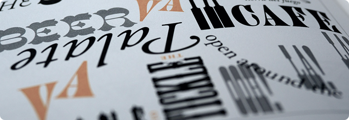
Typography plays a huge role in how your logo is perceived. Using the wrong font can send the wrong message.
Your logo will appear across multiple platforms—websites, social media, print, merchandise. A design that only works in one format fails in the long run.

Trendy designs may look fresh now but can quickly become outdated.
DIY logos may seem cost-effective, but they often lack the polish and strategy professionals bring.



Have a project in mind? Whether it’s web design, branding, or digital strategy,
we’re here to help. Reach out and let’s create something extraordinary.
We are passionate about crafting visually
captivating and highly functional websites.
Dive into our portfolio to witness the impact of
exceptional design firsthand.